A continuous glucose monitor generates an enormous amount of data. Learning to interpret CGM graphs effectively transforms this data from a source of anxiety into a powerful tool for understanding your body and making better management decisions.
Reading Trend Arrows
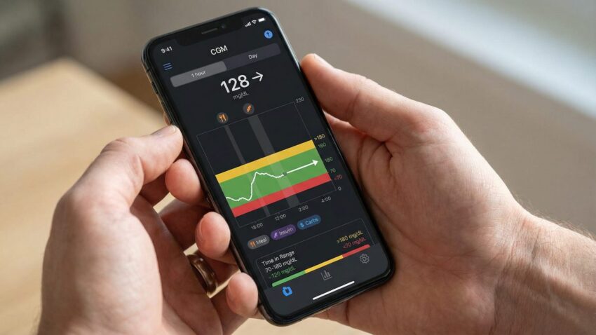
Trend arrows indicate the direction and rate of change of your glucose level at any given moment. Understanding them allows you to take pre-emptive action before glucose reaches a problematic level:
| Arrow | Meaning | Rate of Change |
|---|---|---|
| ↑↑ Double up | Rising rapidly | >3 mmol/L per 15 min |
| ↑ Single up | Rising | 2–3 mmol/L per 15 min |
| ↗ Diagonal up | Rising slowly | 1–2 mmol/L per 15 min |
| → Flat | Stable | <1 mmol/L per 15 min |
| ↓↓ Double down | Falling rapidly | >3 mmol/L per 15 min |
Identifying Patterns
The most valuable use of CGM data is pattern recognition. Look for consistent glucose rises at the same time each day, overnight lows or highs, and post-meal spikes that exceed 10 mmol/L.
✅ Key Takeaway
CGM graphs are most valuable when used to identify patterns rather than to react to individual readings. Focus on your time in range, glucose variability, and consistent patterns at specific times of day. Bring your AGP report to every diabetes appointment.